Standalone illustrations
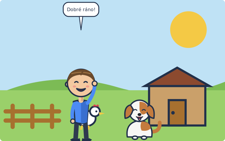
Sometimes you do not want a comic page — you want one picture. A cover, a title card, a single large panel. That is a scene spec: one background filling the whole canvas, with actors, sprites and bubbles on top and no grid around it.
type: scene
scale: 2.4
library:    "../characters"
scenes_dir: "../scenes"
scene: {name: dvur, weather: clear}

actors:
  - {char: tom,  face: happy, arms: wave, x: 0.36, y: 0.72, scale: 0.62}
  - {char: bara, pose: sit, face: happy,  x: 0.62, y: 0.82, scale: 0.34}

bubbles:
  - {text: "Dobré ráno!", kind: speech, speaker: tom, max_chars: 14}
Render it with cmf scene, not cmf render:
type: decides which command renders it
Declare type: scene on every standalone illustration. It costs one line and
buys you a clear error instead of a confusing one: render refuses a scene spec
and points at scene, scene refuses a page spec and points at render, and
validate checks that the declared type matches the structure.
The type is inferred when you leave it out — a top-level background with no
rows: is taken to be a scene — but relying on inference means a typo in rows
silently changes which command your file belongs to.
Canvas size
There is no page: here — no paper, no margins. The canvas comes from the
background:
| Background | Canvas |
|---|---|
scene: |
The scene's own viewBox × scale (default 4) |
image: |
The image's pixel dimensions × scale (default 1) |
So scale is "how many output pixels per unit of the artwork". A scene drawn in
a 320 × 200 viewBox at scale: 3 gives a 960 × 600 canvas.
For a raster background, scale: 1 reproduces the image at its native size —
which is usually what you want, since scaling a bitmap up does not add detail.
What a scene spec accepts
Everything a panel accepts, at the top level of the file:
| Key | Meaning |
|---|---|
type |
scene |
scene / image |
The background — one of the two is required |
scale |
Output pixels per artwork unit |
bg |
Colour behind the background (visible with fit: contain) |
library, scenes_dir, pixel_dir |
Asset directories |
actors, pixel, bubbles |
Contents, same grammar as a panel |
caption |
A narration band along the bottom |
title |
A bold title drawn over the top of the art |
bubble_style, caption_style |
Page-wide look |
Coordinates are fractions of the canvas, exactly as they are fractions of a panel elsewhere. No outline is stroked — but the art is still clipped to a rounded rectangle with the default radius of 10 px. For square corners:
The title sits on top of the picture
On a page, a title: gets its own strip above the grid. On a standalone
illustration there is no strip — the title is drawn over the art near the
top, at 22 px by default. Leave the sky empty, or leave the title out.
An image-backed cover
type: scene
image: "../art/cover.png"
scale: 1
library: "../characters"
bubble_style: {uppercase: true, font_size: 22}
bubbles:
  - {text: "Chapter one", at: bl}
See Raster images for how fit: and embedding work.